Multi Brand Design System
Redesigned Paybar's multi-brand design system to improve consistency, accessibility, and scalability with reusable components and design tokens.
Product Design

Project Overview
Company: Paybar
Industry: SaaS, Fintech
Timeline: March 2025
My Role: Lead Product Designer
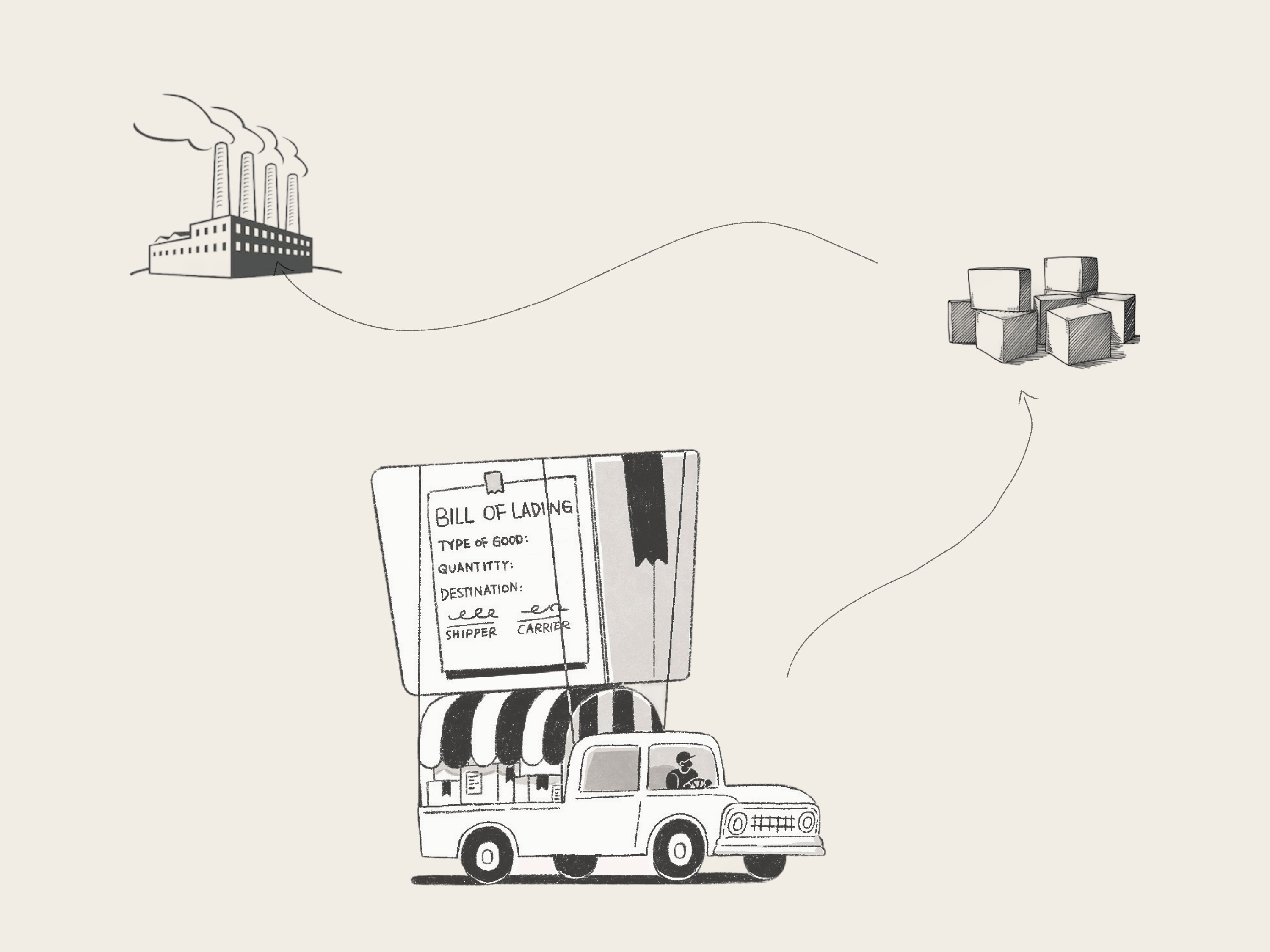
Paybar is a B2B logistics platform offering payment solutions, financing, investment, and banking services. It serves a diverse user base spanning a broad age range, varied roles, and low technical proficiency. The product operates in a fast-paced, marketing-led environment.
Challenge
How might we make an efficient multi-brand design system and address existing issues?
The legacy design system was in place
Inconsistencies in design and developed components.
The company holds subsidiaries with a house-of-brands structure.

Product Audit
A detailed review of existing product experience around the use of the components.
Review and document the product for components that are being misused or misaligned, or for accessibility issues.
worked with the developer to find any current misalignment in design/dev components.

Research
Teamed up with developers to choose a suitable component system foundation.
research component libraries for design compatibility and dev adoptability.
Teamed up with developers to choose the best framework as a scaffold for the component library.

Accessible visuals
Considering users from mine sites to truck cabs, from container offices to modern workstations, and across all age groups.
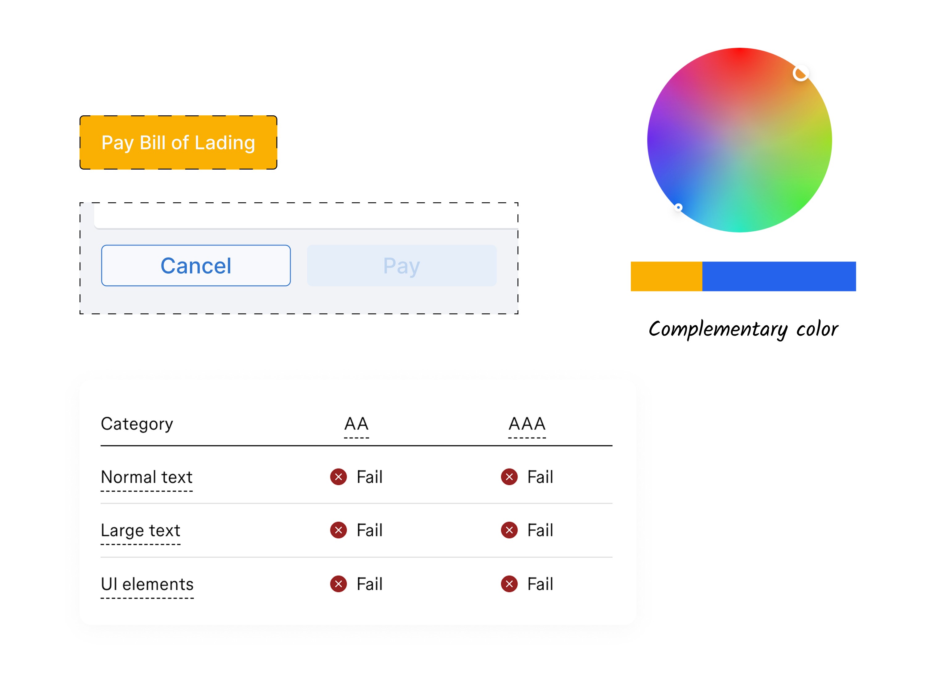
Primary brand orange buttons had an accessibility contrast issue.
The conflicting brand orange was replaced with complementary blue on the primary buttons.
Disabled state without enough contrast
Menu icon buttons with no label
Color System
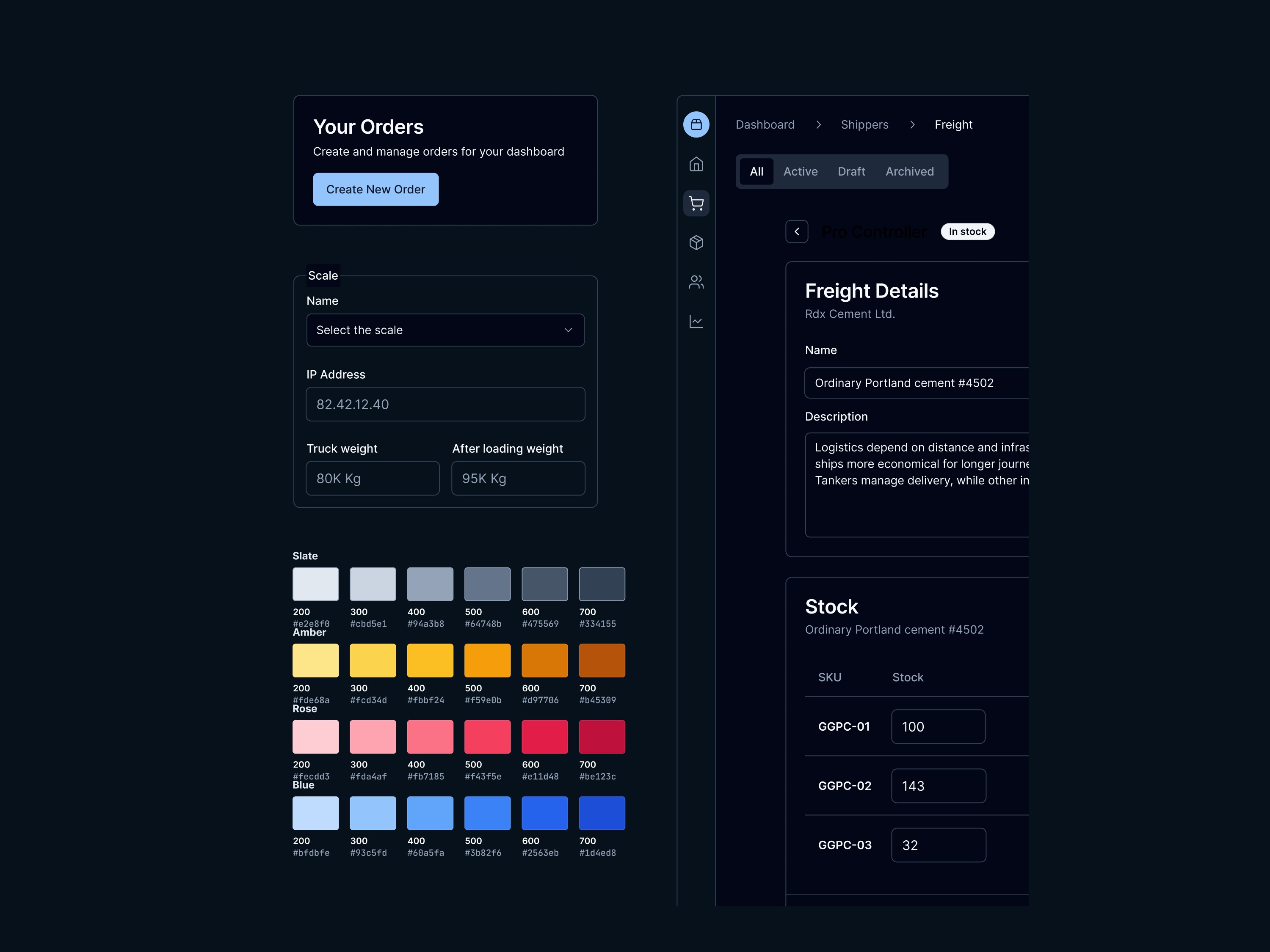
To improve clarity and increase scalability across products, I implemented a semantic colour token system utilising variable modes to seamlessly manage different themes. Recognising that designers are the primary users of this architecture, I prioritised simple, intuitive naming conventions to reduce cognitive load. Furthermore, these tokens were explicitly structured around component interaction, allowing me to tailor specific colour details to perfectly align with the nuanced needs of the product components.
Building upon the established variable modes, I developed a high-contrast dark mode theme specifically designed to support Paybar users operating in low-light environments and drivers during the night.


Learning
Layered theming with Figma variables scales better than a single-set approach for light/dark and brand themes.
Early engineer collaboration guided component library choice and token structure, preventing refactors.
Figma to JSON code sync reduced manual updates and improved the change workflow.