Upselling Subscription Plans
Upselling the upgrade subscription, exploring hypothesis and design practices for payment plans.
Product Design, User Research

Project Overview
Company: Roomvu
Timeline: October 2024
Role: Lead Product Designer, User Researcher
Roomvu provides AI-generated hyper-local videos and lead management for estate agents. The project brief indicates that the upgrade subscription feature in the users' dashboard is underperforming. And the business goal has been set to increase the conversion rate of upgrade subscription in the dashboard, and to upsell the subscription.
Background
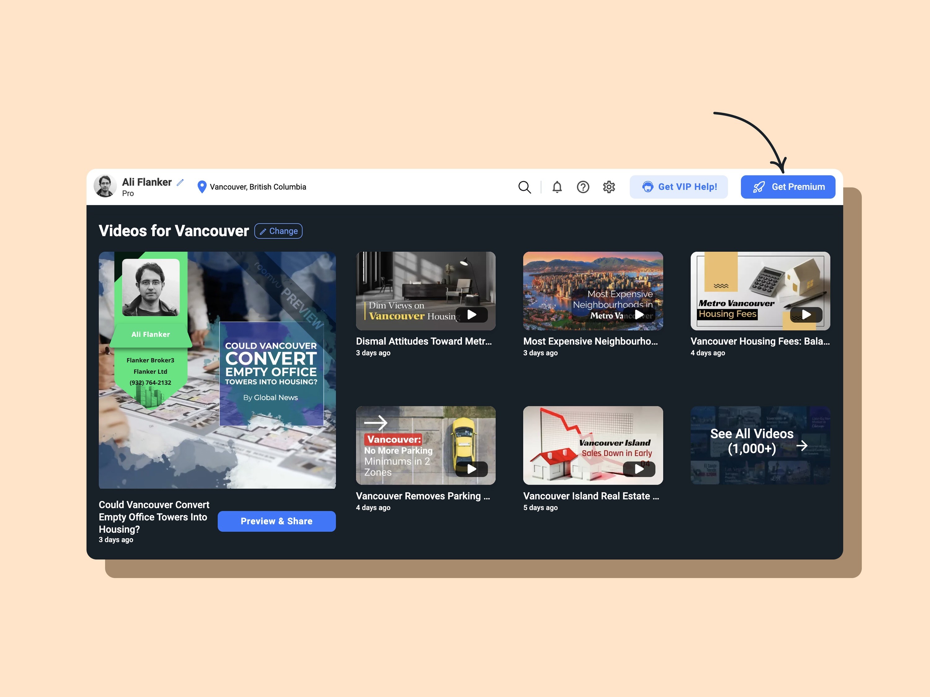
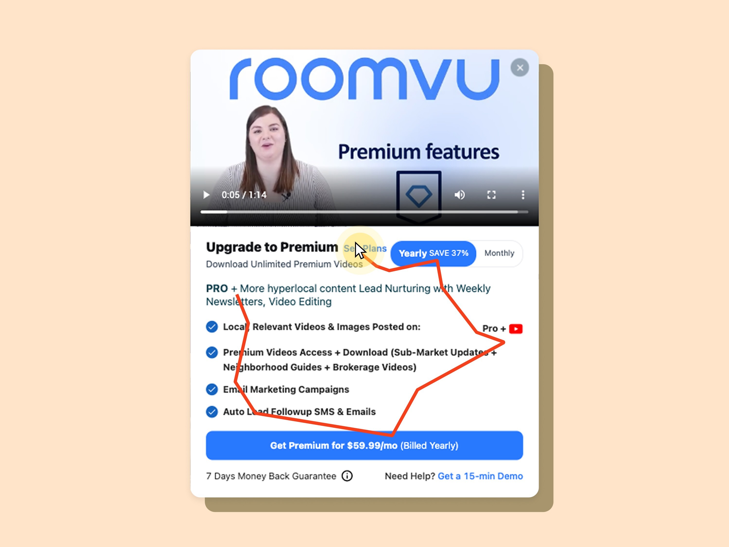
Users in their dashboard can click on the available button to upgrade their subscription. They view a pop-up that shows an upgrade to the next available plan.
Discovery
I observed how users interact with the upgrade subscription dialogue via Hotjar. I noticed a pattern: users either click on the See All Plans button or close the dialogue quickly.
Hypothesis
Based on user behaviour insights, I formulated the hypothesis that presenting all subscription tiers in a single view would help users better understand the value of higher-tier plans, leading to increased upgrades to Premium, Platinum, and Diamond.
Usability Study
To better understand users' decision-making process and validate the underlying problem, I planned and facilitated a moderated qualitative usability study on the existing subscription flow. I recruited and screened five active users from the Free and Pro subscription tiers to uncover usability issues, understand their attitudes toward upgrading, and identify opportunities to improve plan discovery and comparison.
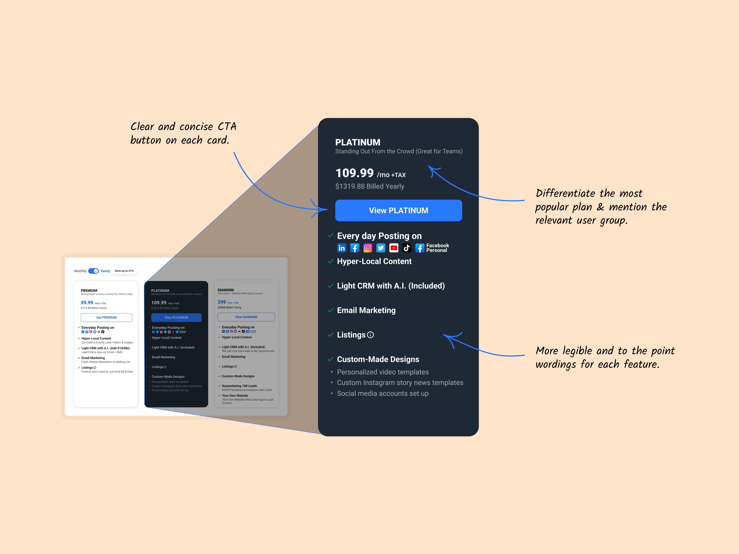
The usability study revealed that users naturally wanted to compare subscription plans based on their features and perceived value before making an upgrade decision. Participants also preferred making their decision within the upgrade popup rather than navigating to a separate pricing page. In addition, the study uncovered several usability issues and opportunities to refine the experience before implementation.
Below are some of these usability issues:
The autoplaying video distracts users.
Too much wording and jargon.
Users have difficulty finding the See Plans link.
The complex CTA label confuses users.
Ideation
I explored multiple design concepts and iterated on them based on feedback from engineers, designers, and the product manager. Through collaborative design reviews and discussions, I refined the solution to balance user needs, business goals, and technical feasibility before finalising the design for developer handoff and live A/B testing.

Design
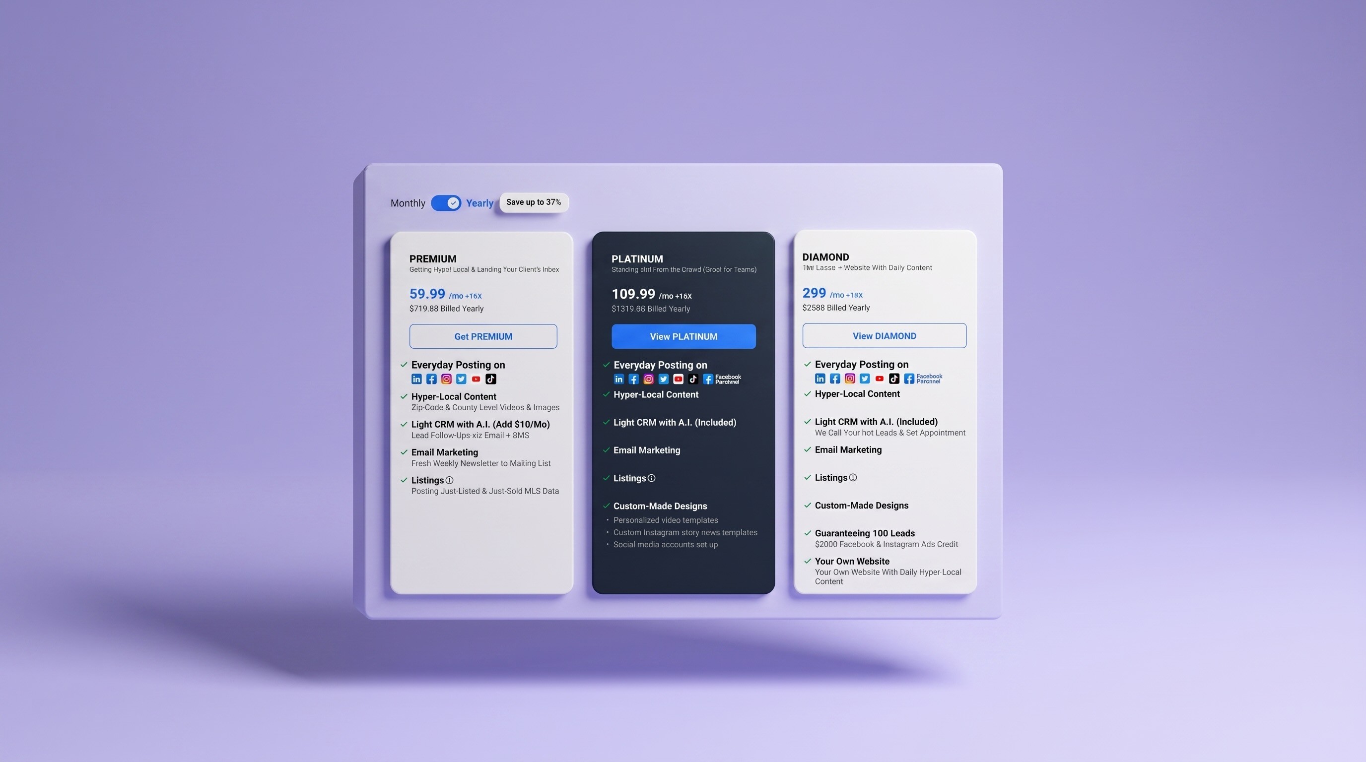
I redesigned the subscription upgrade dialogue to present all plans side by side, making it easier for users to compare features and understand the value of each tier. During the design process, I applied the Lawnmower Principle to guide progressive decision-making, benchmarked comparison patterns from products such as Canva and Hootsuite, and collaborated with the marketing content designer to refine the UX copy for greater clarity and persuasion.
A/B Testing
I worked directly with the front-end team, the data scientist, and the PM to set the action log triggers. Test segmented to Free and Pro users and ran for about a month.
Test Findings
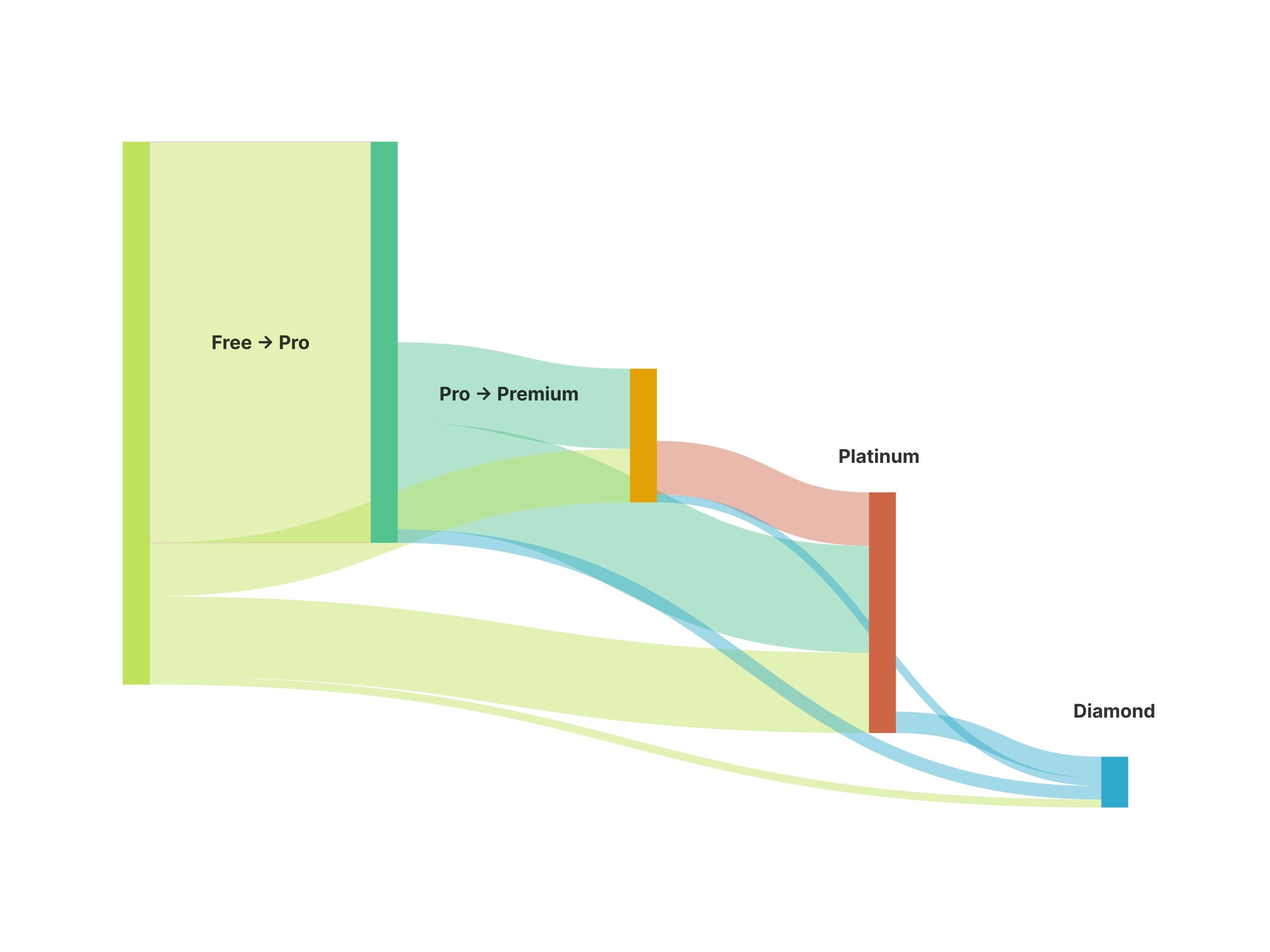
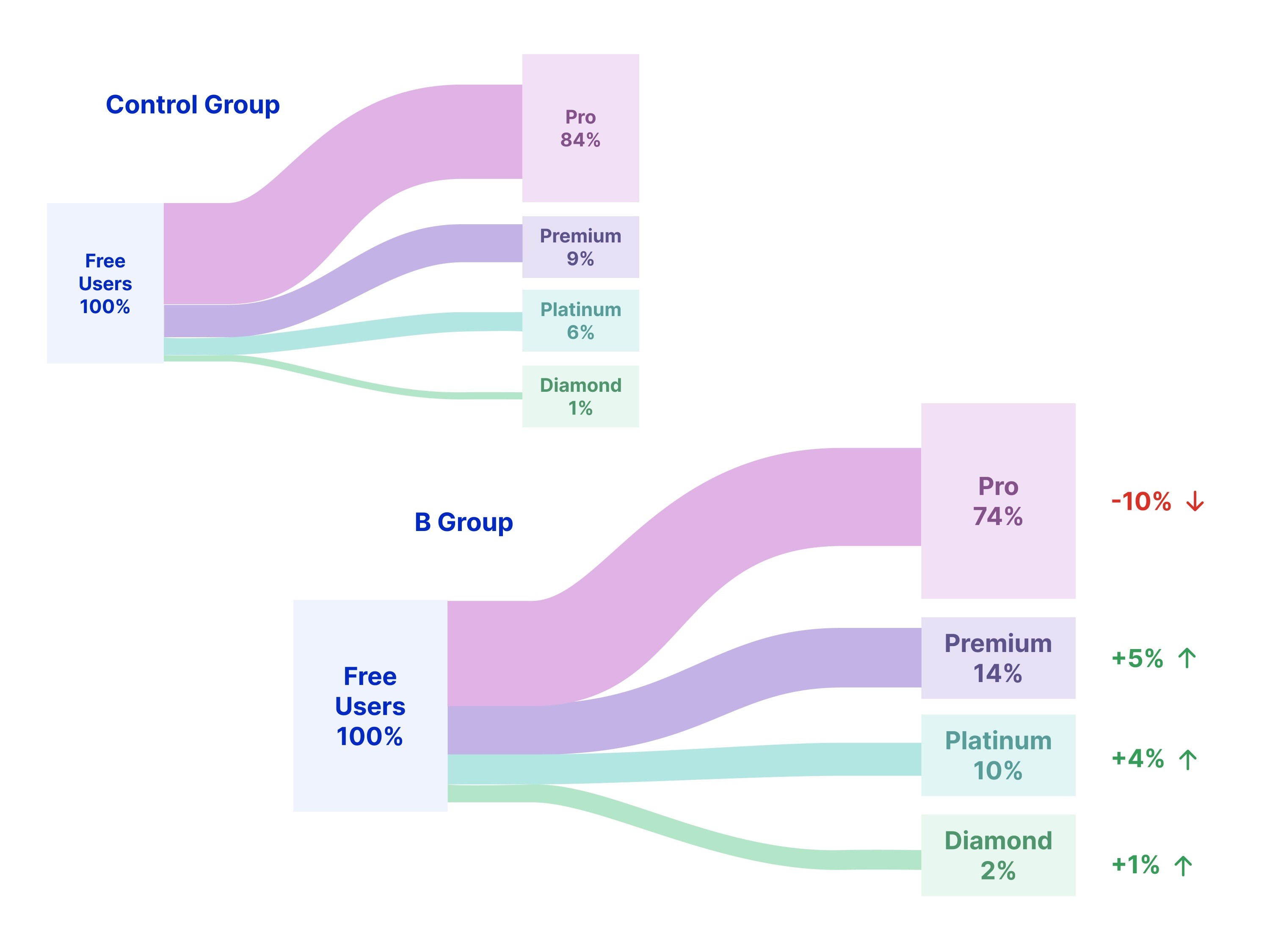
The A/B test showed that the overall upgrade conversion rate remained largely unchanged across both variants. However, users in the new experience were significantly more likely to upgrade to higher-value plans, with noticeable increases in subscriptions to Premium, Platinum, and Diamond. As a result, the redesigned upgrade flow increased subscription revenue by 38%.
Key Takeaway
Presenting all subscription tiers in a single comparison view encouraged users to evaluate the full range of plans rather than only the next available upgrade. By making the value of higher-tier plans easier to compare, the new design shifted users toward Premium, Platinum, and Diamond, driving a substantial increase in subscription revenue without increasing the overall conversion rate.